ShopDreamUp AI ArtDreamUp

Deviation Actions


Suggested Deviants


Suggested Collections


You Might Like…


Description
Sorry for the crapola scan. I tinkered with the piece when stitching it together but its still a tad washed out.
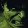
Basically in a nutshell i havent been happy with the quality of my stuff lately and decided to do a piece to make myself work harder.
I LOVED John Byrnes run on the Namor book back in the early nineties. I thought he made that character way more interesting than had been done before. His basic premise was since Namor had beef with surface dwellers mucking up the oceans, he would use the treasures in the sea to make himself a billionaire and fight his eco fight via big buisness. plus he kinda came up with kinda a cool reason why Namor could be a jerk at the drop of the hat. John wrote some interesting concepts there and it made me a huge fan of the character just on that short run alone.
In this take i I just really incorporated design stuff from various eras of Namor's past. I really dug that Black leather suit with the webbed/fin armpit thing from the seventies ( anyone notice that a lot of chracters back then had that armpit thing going on in their designs----Namor, Spiderwoman, Spidey etc) also I played with the gauntlets and give them that Ultimate FF Namor thing, then i added that "s" clamshell belt.
If you look closely at the scaly design on the torso area, the design is a upside down Trident shape and the scales are a call back to his scaly swim trunks. And finally, The leg guards are something that i wanted to add but I shamefully swiped the texture idea from a sketch of Ann O'brien that was in the Modern Masters Arthur Adams book. When I saw that sketch the texture just screamed to me "coral". Art seems like he just , around 2000 became a texture JUGGERNAUT. everything he does , while still being very animated, is crazy illustrative.
A lot of the idea here was to play with his design so that it was a bit more fun and imply his regal heritage more.
The only thing I'n not entirely happy with was the upshot of the head as its cocked back in a smug sorta way but its not modeled very well....
When doing a shot of the head like this, structure is REALLY important. I've done this type of shot tons of times in my sketchbook, and am fairly comfortable with it. I say that because it can get tough to pull off ( especially the nose...you can end up with a pignose VERY easy in this type of foreshortened shot. So, the catch is , much with drawing women, you have to pull back and not render too much and let shadows and forms create the shapes, not crazy linework. Obviously I didn't do that here and I kinda paid for it. I still got the cockiness but his face is a bit more brutish than i wanted.
Also I've been known to beat the hell outta my paper by erasing too much or pressing too hard ( especially when its not how i like and i keep going over something) and didn't want to erase too much. I finally deciided to just let it be. ( sorry for the rant....but i wanted to articulate the tightrope i walk when i draw an upshot of the face...)
As a whole the original art is much easier on the eyes than the scan but I hope someone likes it, its one of the few times where the art came out close to what I saw in my head.
oh yeah BTW,
Namor is copyright Marvel comics
Image size
655x1020px 309.26 KB
© 2008 - 2024 Kevin-Sharpe
Comments40
Join the community to add your comment. Already a deviant? Log In
The web was just hit with a nasty rumor of James Robinson tackling Namor. Probably not true, but you and him on this would be an aces book.